Where Every Space Finds Its Own Expression
A home does not always need one colour palette to feel connected. Sometimes, the connection comes through a shape, a material or a detail that quietly appears in different ways throughout the space. This home at Aparna Cyber Heights takes that approach, giving every part of the interiors its own mood while maintaining a consistent design language.
Warm cream and white tones create the foundation, complemented by walnut-toned wood, brass accents and marble-inspired surfaces. From there, each space introduces its own colour and character. Olive green brings freshness, terracotta adds warmth, while blush pink gives the children’s space a more playful personality. Rather than making everything match, the design allows these individual choices to work together.
The television wall combines light oak ribbed panelling with a marble-textured panel behind the screen, creating contrast between the warmth of wood and the clean appearance of stone. A floating console below introduces an unexpected detail with a lit trough of river pebbles running along its length. Nearby, a reeded-glass and wood partition creates a soft division between the seating and dining areas without making the home feel closed off. The fluted detailing becomes a recurring material language that appears again in other parts of the home.
The dining setting continues the warm, understated palette. Full-length curtains frame the space, while a glossy cream crockery unit features two arched display niches with integrated lighting. Across from it, a hand-painted peacock artwork adds a touch of individuality. Its muted colours allow the artwork to sit naturally within the space rather than becoming an overpowering focal point.
The pooja space has been treated as a dedicated room, with its entrance becoming part of the overall design. Reeded glass sits within a wooden frame, while small brass bells are arranged within the panels at chest height. Long brass handles add another layer of detail, giving the entrance a distinct identity while maintaining the warm material palette used throughout the home.
The kitchen introduces the strongest change in colour, pairing olive green gloss lower cabinets with cream gloss overhead storage. Black countertops and trims create a clean visual boundary between the two tones. On either side of the chimney, arched fluted-wood niches break the long stretch of cabinetry and add an architectural detail without taking away from the functionality. A drop-down wooden shelf on the side provides additional preparation space while keeping the wall visually light.
Personalised Spaces with Distinct Character
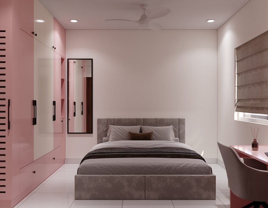
The kids' bedroom takes a playful approach with a glossy blush-pink wardrobe paired with a bold black striped panel inspired by piano keys. A grey upholstered bed and coral study desk balance the strong wardrobe colour, giving the space a youthful look while keeping the overall design clean and considered.
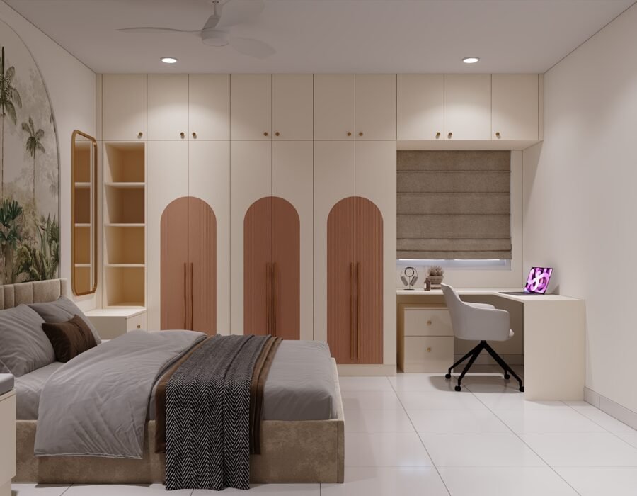
The master bedroom brings in a warmer, more refined palette through a palm mural framed within an arch behind the bed. Three terracotta fluted wardrobe panels continue the curved form against a cream wardrobe, while a gold-framed mirror echoes the same arch detail. The combination of terracotta, cream and natural-inspired artwork creates a warm focal point without adding unnecessary colour throughout the room.
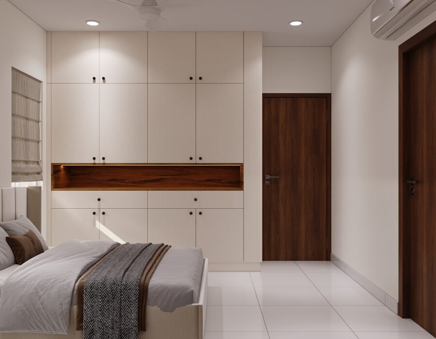
The guest bedroom takes a quieter approach with cream wardrobes and a black-and-white graphic panel that subtly connects it to the other spaces. A wood-lined open niche adds warmth and breaks the larger wardrobe surface, while the restrained palette keeps the space simple, comfortable and visually balanced.